
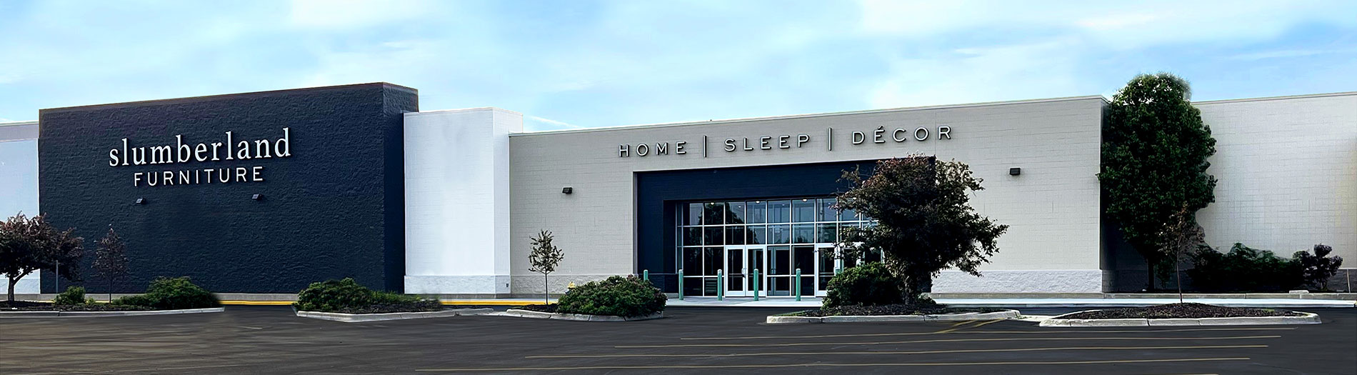
SLUMBERLAND FURNITURE ~ BRANDING
Slumberland Furniture, a major Midwest furniture retailer, was seeking a refreshed brand identity. To most shoppers, the brand had become known as the "puffy furniture people," and it wanted a more modern, contemporary look. I was brought on as a freelance Creative Director to develop the rebrand: a new logo, typography system, and color palette, plus redefined image direction and layout styles.



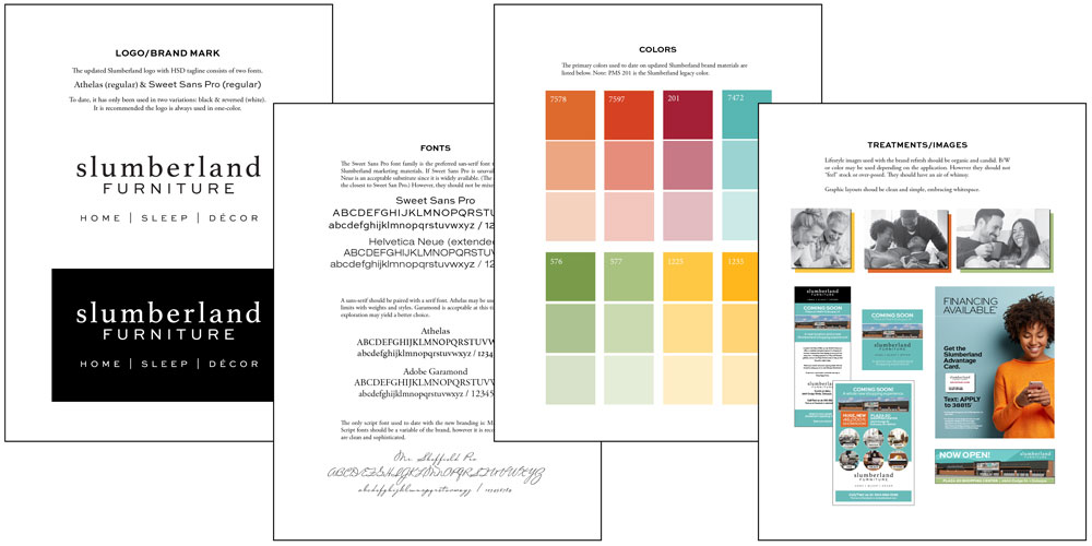
The first step was the logo. A few early concepts were in play when I joined, but none had landed. I designed the final logo, choosing a typeface that felt modern while still honoring the brand's traditional roots, and opening up the mark to create a lighter, fresher feel. This evolution reflected the brand's move away from bulky, dated furniture toward designs that are functional yet elegant.

The next step focused on the color palette and typography. Slumberland had long relied on burgundy as a primary brand color—one also commonly used by several competitors. The challenge was to evolve the palette in a way that acknowledged this legacy color while introducing a more modern, fresh feel. The updated palette was designed to complement the lighter, more open direction established by the new logo.

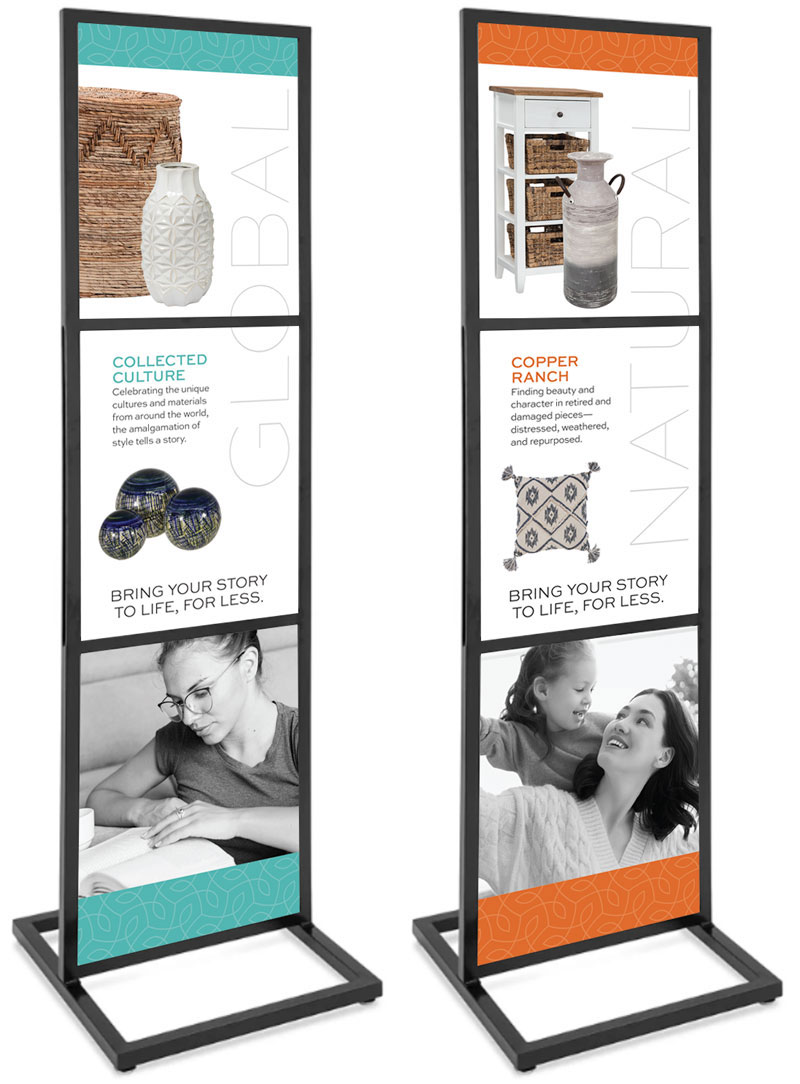
Lastly, we focused on imagery and layout. The brand was missing a strong sense of lifestyle. By introducing imagery centered on real people enjoying their furniture, we shifted the brand toward a warmer, more human expression—one that reinforced the idea of bringing happy home.


The revised brand was fully realized in what Slumberland calls the “Store of the Future.” The first location opened in Iowa in 2021 and now serves as the blueprint for future store design and brand expression.


